Visualizing the 2019 Measles Outbreak in NYC (with Python)
PyData NYC 2019 tutorial, Nov 6, 2019
Carlos Afonso ( linkedin.com/in/carlos-afonso-w )
- GitHub repository: github.com/carlos-afonso/measles
- README.md describes the package requirements and provides installation instructions
- Directory containing all the tutorial materials: pydata-nyc-2019
- Tutorial notebook (this notebook):
pydata-nyc-2019-tutorial.ipynb( .ipynb ) ( .html )- If you have problems seeing the .ipynb version, you can always see the static .html version
- Project webpage: carlos-afonso.github.io/measles
Acknowledgements
Thanks to:
- PyData NYC 2019 organization for giving me the opportunity to present this tutorial
- NYC Health for making the measles data available online
Disclaimers
- This is a personal project.
- I am not affiliated with NYC Health.
- This is not medical advice.
- This notebook is intentionally verbose (for those following the tutorial only with the notebook).
- The tutorial presentation is open to discussion and questions.
Summary
Context:
- Example of a small data project that can help people understand an important issue.
- The US is amid its largest measles outbreak since 1992, with 1,250 cases as of Oct 3, 2019.
- Most cases (649) were in NYC, where the outbreak was declared over on Sep 3, 2019.
Goals:
- Discuss and show how to create data visualizations that help understand the 2019 measles outbreak in NYC.
- Bubble maps and bar charts are created using Python (bokeh, matplotlib) and following principles of clarity and context.
 |
 |
 |
 |
Introduction
Carlos Afonso
Passionate about using Data Science to solve important problems
Data Scientist with diverse industry experience and multidisciplinary STEM background
- MSc in Physics Engineering (IST, Portugal)
- Research toward PhD in Biomedical Engineering (University of Oxford, UK) - unfinished
- 4 years of professional experience solving Data Science problems for a variety of clients and industries
Created the Visualizing the 2019 Measles Outbreak open source project.
Connect with me on linkedin.com/in/carlos-afonso-w
Motivations
Initial: The large majority of NYC measles cases were in my neighborhood (Williamsburg, Brooklyn).
- NYC Health provides the names of all the affected neighborhoods but I didn't know the location of most of them. I imagine many people would not know the location of those neighborhoods either. So, I thought I could create a visualization to highlight those neighborhoods on the NYC map.
Technical / Practical: Opportunity to learn / practice / showcase fundamental and advanced data visualization skills.
General: Example of a small data project that can help people understand an important issue.
- A challenge for you: Think about your experiences and your communities, and see if you can find an interesting data project to work on.
What is measles?
Measles is a very contagious disease caused by a virus. It spreads through the air when an infected person coughs or sneezes.
Measles can be prevented with MMR (measles, mumps, rubella) vaccine. CDC recommends children get two doses of MMR vaccine:
- first dose at 12 through 15 months of age,
- second dose at 4 through 6 years of age.
The MMR vaccine is very safe and effective at preventing measles:
- one dose is about 93% effective,
- two doses are about 97% effective.
Reference: Centers for Disease Control and Prevention (CDC): https://www.cdc.gov/vaccines/vpd/measles/index.html
Measles in the US
(1963) Before the measles vaccination program started in 1963, an estimated 3 to 4 million people got measles each year in the United States.
- Of these, approximately 500,000 cases were reported each year to CDC; of these:
- 400 to 500 died,
- 48,000 were hospitalized, and
- 1,000 developed encephalitis (brain swelling).
Since then, widespread use of measles virus-containing vaccine has led to a greater than 99% reduction in measles cases compared with the pre-vaccine era.
(2000) Measles was declared eliminated from the US in 2000, thanks to an effective vaccination program.
However, measles is still common in other countries. Unvaccinated people continue to get measles while abroad and bring the disease into the United States and spread it to others.
(2019) The US is amid its largest measles outbreak since 1992, with 1,250 (preliminarily) confirmed cases as of Oct 3, 2019.
- Most of those cases (649) were in NYC, where the outbreak was declared over on Sep 3, 2019.
References:
- Centers for Disease Control and Prevention (CDC):
- NYC Health Department: https://www1.nyc.gov/site/doh/health/health-topics/measles.page
Data
Data Source
Of all the affected areas, NYC provides the best data about the 2019 measles outbreak.
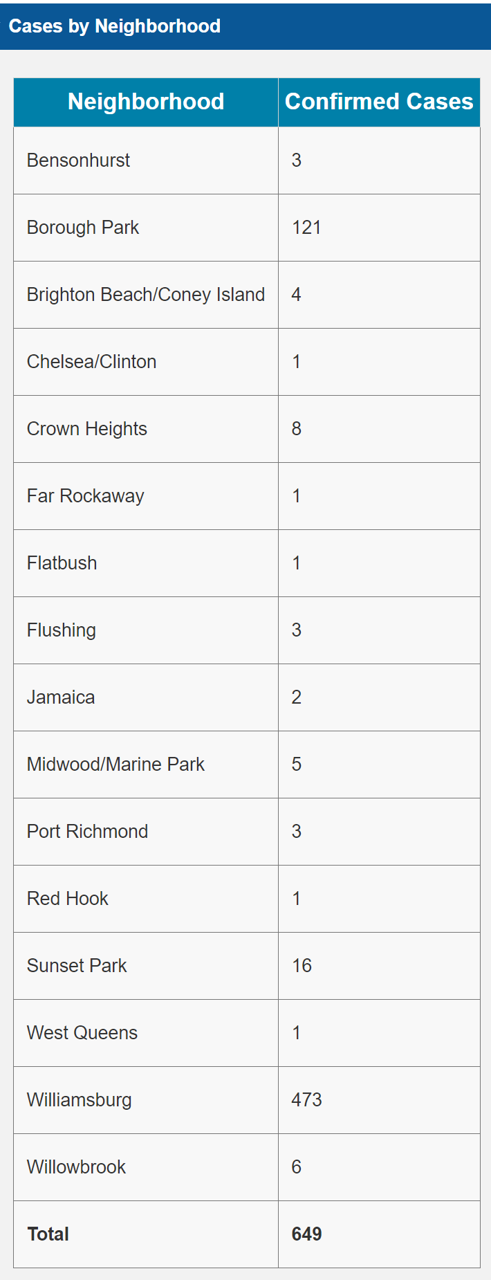
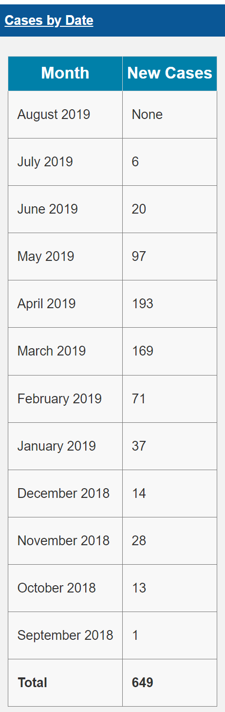
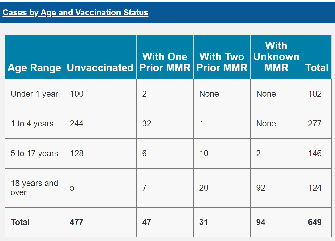
The NYC Health Measles webpage provides raw data about the number of measles cases by:
- Neighborhood
- Date
- Age and Vaccination Status
Screenshots (from Nov 5, 2019), in case we can't access the website during the tutorial:
 |
 |
 |
 |
Data Collection
Data versions:
- Preliminary data (during the measles outbreak):
- Collected / Updated the data manually and stored in CSV or XLSX files.
- Used manual approach because the data was small and updated infrequently (about once a week).
- Web Archive can be useful to find older data versions, as it saves different temporal versions of webpages.
- Web Archive has several temporal versions of the NYC Health Measles webpage: https://web.archive.org/web/*/https://www1.nyc.gov/site/doh/health/health-topics/measles.page
- "Final" data (after the outbreak was declared over on Sep 3, 2019)
- Collected the data manually and stored in CSV files
- Used manual approach because the data was small
- No need to update the "final" data so far (the outbreak remains over, as of Nov 5, 2019)
Notes:
- This tutorial use only the "final" data version.
- "Cases by Age" and "Cases by Vaccination Status" saved is separate CSV files.
- Always collect and save the "start date" and "end date" information.
Let's read and have a quick look at the data:
import os
import pandas as pd
- NYC measles cases by age data:
pd.read_csv(os.path.join('..', 'data', 'nyc-health', 'final',
                         'nyc-measles-cases-by-age.csv'))
- NYC measles cases by vaccination status data:
pd.read_csv(os.path.join('..', 'data', 'nyc-health', 'final',
                         'nyc-measles-cases-by-vaccination-status.csv'))
- NYC new measles cases by month data:
pd.read_csv(os.path.join('..', 'data', 'nyc-health', 'final',
                         'nyc-new-measles-cases-by-month.csv'))
- NYC new measles cases by neighborhood data:
pd.read_csv(os.path.join('..', 'data', 'nyc-health', 'final',
                         'nyc-measles-confirmed-cases-by-neighborhood.csv'))
Visualizations
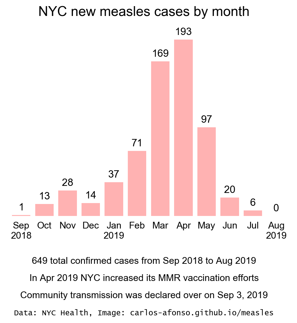
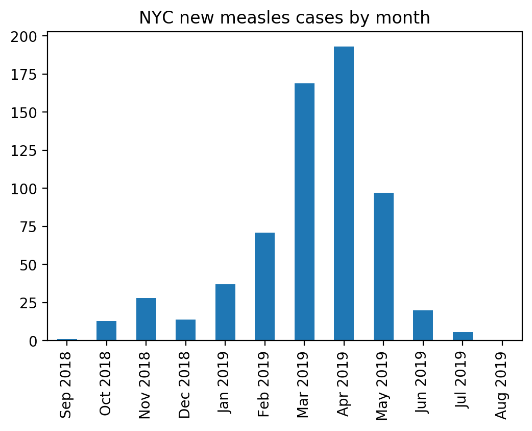
NYC new measles cases by month
- Example of how to create a vertical bar chart to display temporal data.
- Show how to adjust the bar chart properties to provide context and clarity:
- For context: use title and annotations to provide the necessary information.
- For clarity: remove unnecessary chart elements, format month names, show labels with the number of cases.
- Insights: The bar chart clearly shows that, after peaking in Apr 2019, the number of new measles cases declined progressively until it reached 0 in Aug 2019. This is an indication that the additional MMR vaccination efforts that the NYC Health department started taking in April 2019 seem to have helped control the outbreak.
- Below, we compare the default matplotlib bar chart (left) with the improved bar chart (right), for this data.
- Notebook used to create these bar charts:
nyc-new-measles-cases-by-month-final.ipynb( .ipynb ) ( .html )- If you have problems seeing the .ipynb version, you can always see the static .html version.
| Default | Improved |
|---|---|
 |
|
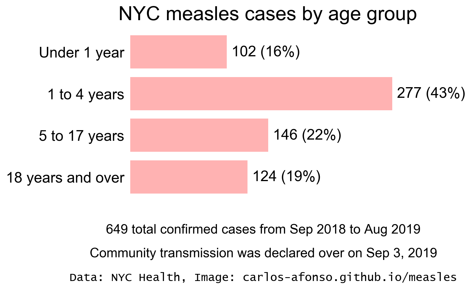
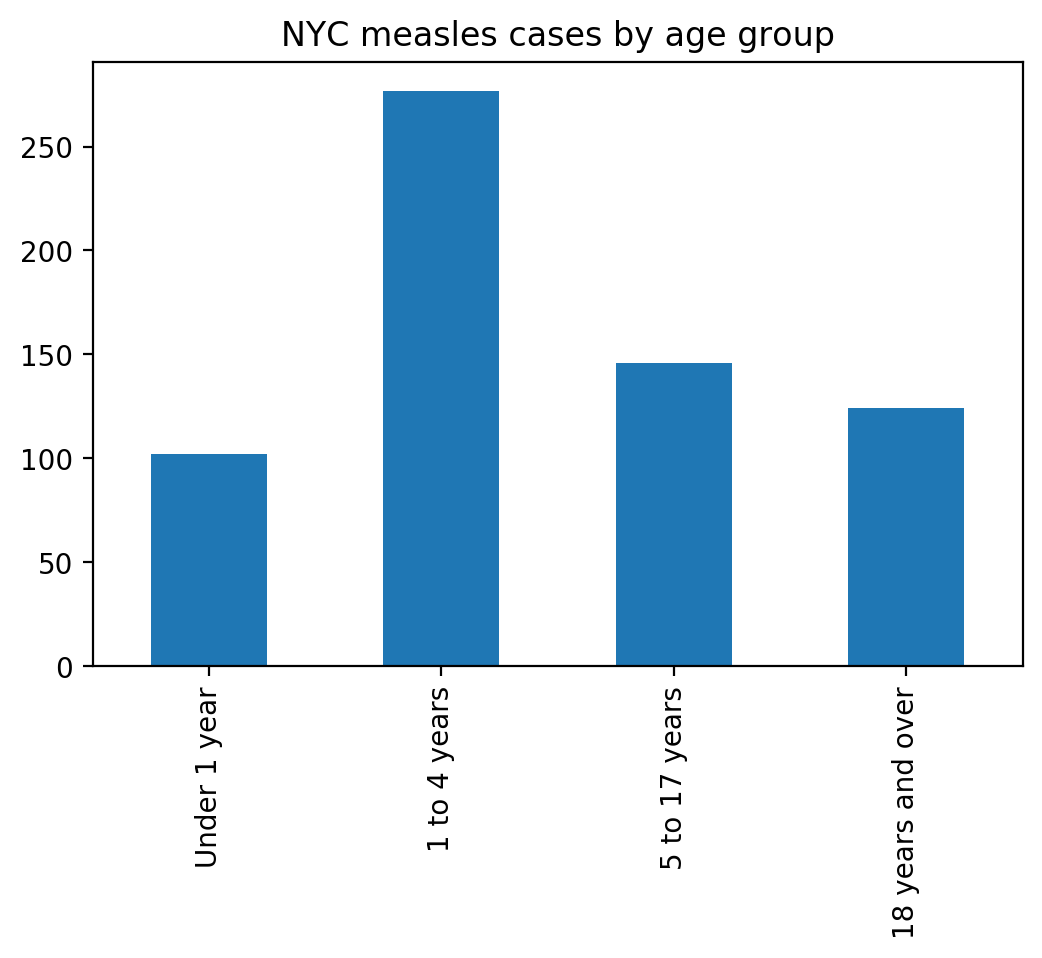
NYC measles cases by age
- Example of how to create a horizontal bar chart to display categorical data.
- Example of a case when it is better to use a horizontal rather than a vertical bar chart.
- Show how to adjust the bar chart properties to provide context and clarity.
- For context: use title and annotation to provide the necessary information.
- For clarity: remove unnecessary chart elements, show labels with the number and percentages of cases.
- Insights: The bar chart shows that most of the NYC measles cases are in young children.
- Below, we compare the default matplotlib bar chart (left) with the improved bar chart (right), for this data.
- Notebook used to create these bar charts:
nyc-measles-cases-by-age-final.ipynb( .ipynb ) ( .html )- If you have problems seeing the .ipynb version, you can always see the static .html version.
| Default | Improved |
|---|---|
 |
|
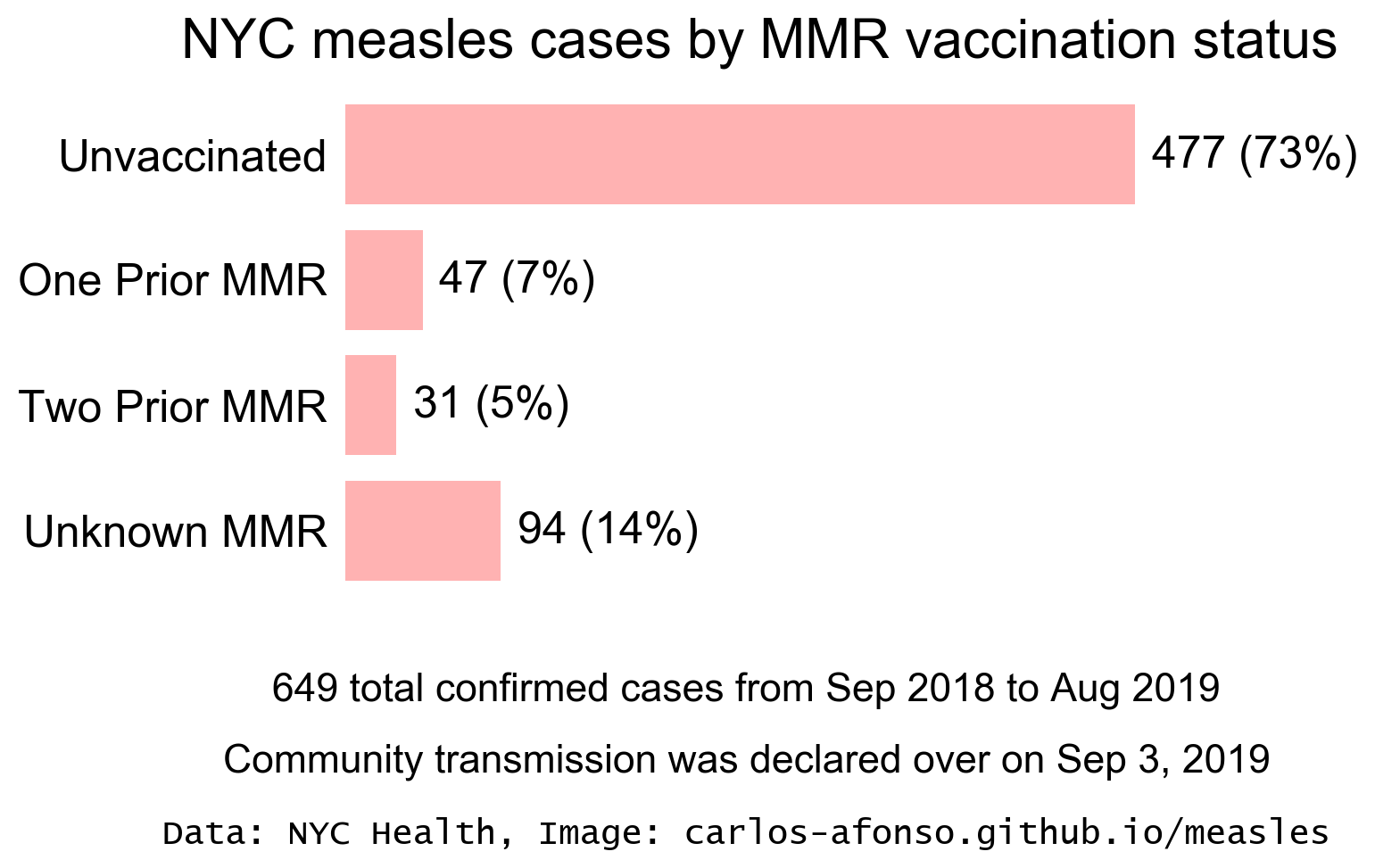
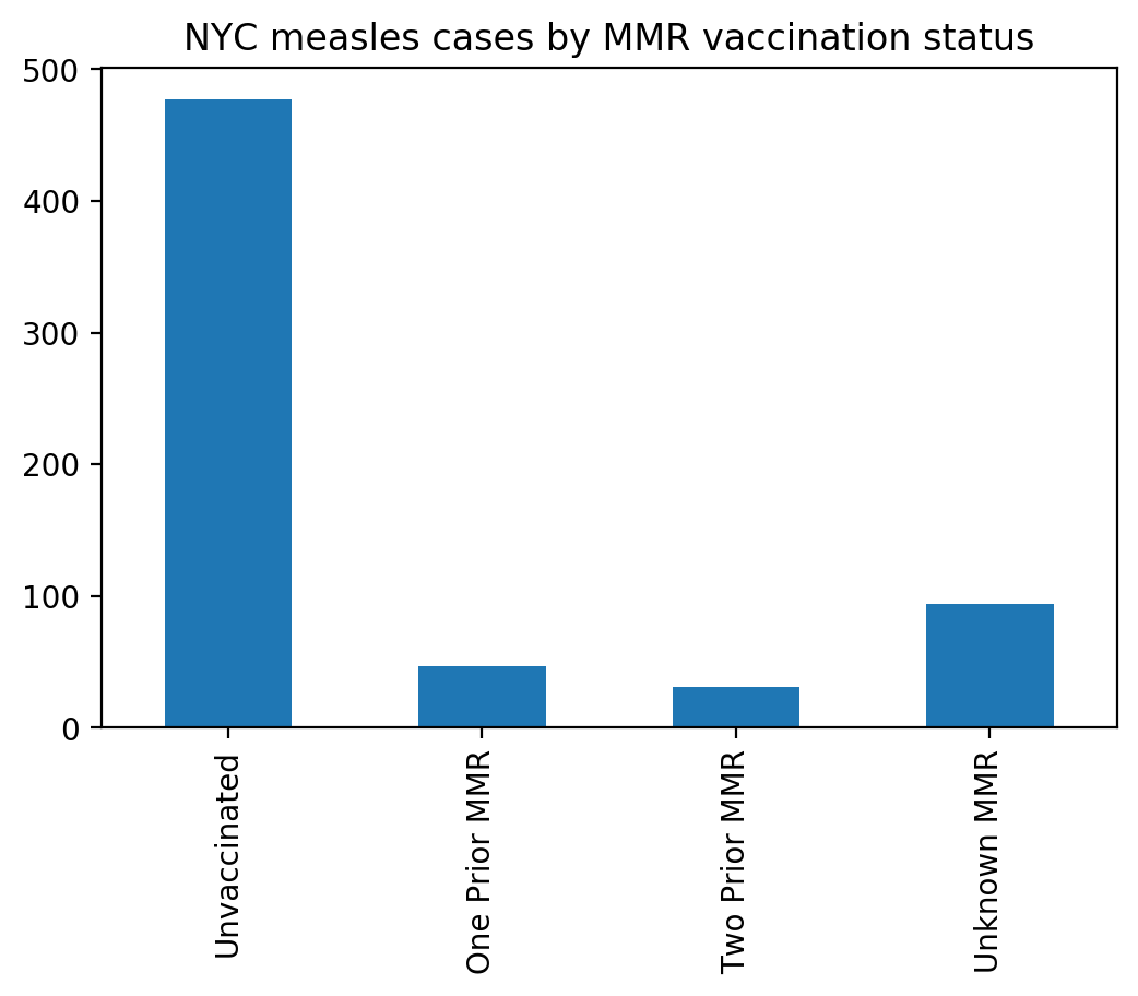
NYC measles cases by vaccination status
- Technically this is a horizontal bar chart similar to the one in the previous section (NYC measles cases by age).
- Insights: This bar chart clearly shows that the large majority of the people who got measles were unvaccinated.
- Below, we compare the default matplotlib bar chart (left) with the improved bar chart (right), for this data.
- Notebook used to create these bar charts:
nyc-measles-cases-by-vaccination-status-final.ipynb( .ipynb ) ( .html )- If you have problems seeing the .ipynb version, you can always see the static .html version.
| Default | Improved |
|---|---|
 |
|
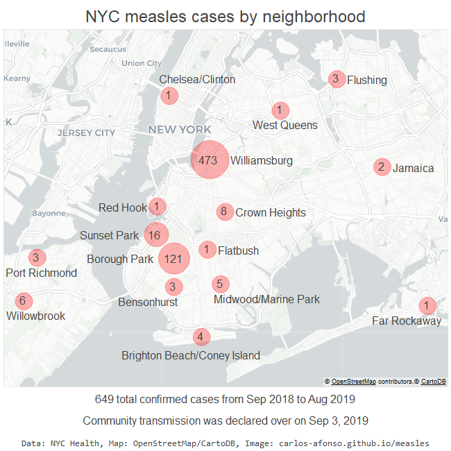
NYC measles cases by neighborhood
- Example of how to use bokeh to create a bubble map visualization.
- Show and discuss the several design decisions to provide context and clarity:
- Explain how in this case it is better to use a static rather than an interactive map.
- Explain the decision to show labels with the names of the neighborhoods and the respective number of measles. Although the labels “clutter” the map, they are important because they help identify the neighborhoods.
- Insights: The bubble map clearly shows all the NYC neighborhoods with measles cases, using the bubble size to represent the number of cases.
- Below, we compare the SVG and PNG versions of the map to highlight an issue with the embedding of the SVG image in an HTML page: the background map (in the SVG image) is not displayed.
- Notebook used to create this bubble map visualization:
nyc-measles-cases-by-neighborhood-final.ipynb( .ipynb ) ( .html )- If you have problems seeing the .ipynb version, you can always see the static .html version.
| SVG | PNG |
|---|---|
 |
|
Project webpage
All data visualizations are shown in the project homepage (using GitHub Pages): https://carlos-afonso.github.io/measles
Reference: Working with GitHub Pages
Export notebook as HTML
# Export this notebook as a static HTML page
os.system('jupyter nbconvert --to html pydata-nyc-2019-tutorial.ipynb')